

Approximately half of web traffic around the world is on mobile devices, and that’s something you just can’t ignore as a business.
Creating the best user experience on mobile should be treated with just as much care and strategy as desktop—just remember that these are two different experiences and so you’ll need a whole new approach for mobile.
In this article, we’ll review how to make website mobile responsive, why it’s important, and the approaches you can take to succeed.

Table of Contents
- Mobile Website vs Mobile App
- Should You Create a Mobile Website or a Mobile App?
- Creating a Responsive Website
- Set Breakpoints
- Create Fluid Layouts
- Adapt for Touchscreens
- Make Sure Images and Videos are Responsive
- Create Responsive Typography
- Test for Responsiveness on Real Devices
- Why Mobile Responsiveness Matters
Before diving into how to make a desktop site mobile friendly, I first want to explore the differences and similarities between having a mobile website and a mobile app.
First and foremost, know that they’re not the same thing.

Photo Credit: medium.com
While both are designed to be accessed from mobile devices and tablets, they’re more different than they are similar.
A mobile website is simply a desktop site that can scale and adapt to smaller screen sizes, like smartphones. It’s accessed through mobile browsers by visiting the website’s URL address.
There’s no need to download anything.
With a mobile app, on the other hand, you would download and install the app from the App Store or Google Play, and it would then be saved to your mobile device.
Having an app directly on a mobile device is much easier for users to quickly access rather than having to type in a URL in their mobile browser, even if the website is mobile responsive.
1.1 Should You Create a Mobile Website or a Mobile App?
Generally speaking, no matter what your business is, it’s a good idea to start with a mobile website, which isn’t as time consuming and costly as creating a mobile app.
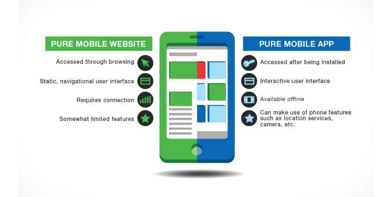
Photo Credit: biznessapps.com
This is a business’s very first step in creating a mobile presence for users.
Whether or not you should continue to the next step of creating a mobile app really depends on what your goals are as a company.
Just know that mobile apps can be incredibly beneficial for all types of businesses and they offer quite a bit in the way of features.

Here are just a few benefits of having a mobile app for your users:
Increased visibility and accessibility: Mobile apps make it easier for users to access your products or services, and they can easily find your app in app stores.
Improved customer engagement: A mobile app can offer a more personalized and engaging experience for users, which can lead to increased customer loyalty and retention.
Enhanced user experience: Mobile apps can be designed to provide a seamless user experience, with intuitive navigation and user-friendly interfaces.
Improved marketing and branding: An app can be a powerful tool for marketing your brand, as it can provide a platform to showcase your products or services and communicate with your customers directly.
Increased sales and revenue: A well-designed mobile app can make it easier for users to make purchases, which can lead to increased sales and revenue for your business.
Access to user data and insights: Apps can provide valuable data and insights into user behavior and preferences, which can be used to improve your products or services.

PRO TIP:
Once you create a mobile responsive website, start with analyzing the traffic coming from mobile app users and evaluating your business goals to determine if it’s worth it to create a mobile app.
As mentioned in the previous chapter, responsive web simply means that your website looks and functions well on not just desktop, but on mobile and tablet devices as well.
Poor UX and UI on mobile devices can alienate users and overall reduce your company’s reach.

Mobile-friendliness is also a key parameter when it comes to ranking higher in Google’s search algorithm, so don’t neglect it.
Now let’s review the steps involved in creating responsive web design.
2.1 Set Breakpoints
When you create a mobile website, you’ll need to start by setting appropriate responsive breakpoints.
A breakpoint is essentially the point at which a website’s design and content will adjust so that it looks best on a specific screen size.
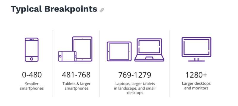
Since a website can be accessed from different devices and screen sizes, it’s important to set multiple breakpoints so the screen will render perfectly across all of them.
This is also referred to as media query breakpoints and CSS breakpoints since you’re creating CSS that’s meant to kick in only at these specific breakpoints.
By not setting any breakpoints, it’s very likely that images will get cut off, content overlaps other content on the web pages, and so on.

PRO TIP:
Open up your browser and visit any website. Minimize the screen slowly to see the content on the page adapt to the new screen size. You’ll notice that the mobile layout on the page changes so it looks great no matter how big your screen is.
These are breakpoints (media queries) in action!
Here are some of the most common responsive breakpoints you can set for popular screen sizes:
- 360 x 640 (mobile)
- 375 x 667 (mobile)
- 360 x 720 (mobile)
- 375 x 812 (iPhone X)
- 411 x 731 (Pixel 2)
- 768 x 1024 (tablet)
- 1266 x 768 (laptop)
- 1920 x 1080 (desktop or high-resolution laptop)

2.1 Create Fluid Layouts
Fluid layouts, also known as fluid grids, are crucial for modern responsive web design.
This concept relies on establishing dynamic values like the percentage of the viewport width (as opposed to setting static values like pixels, which is how it used to be done).
This kind of layout will position and set the various web elements on a page in proportion to the screen size it’s being displayed on.
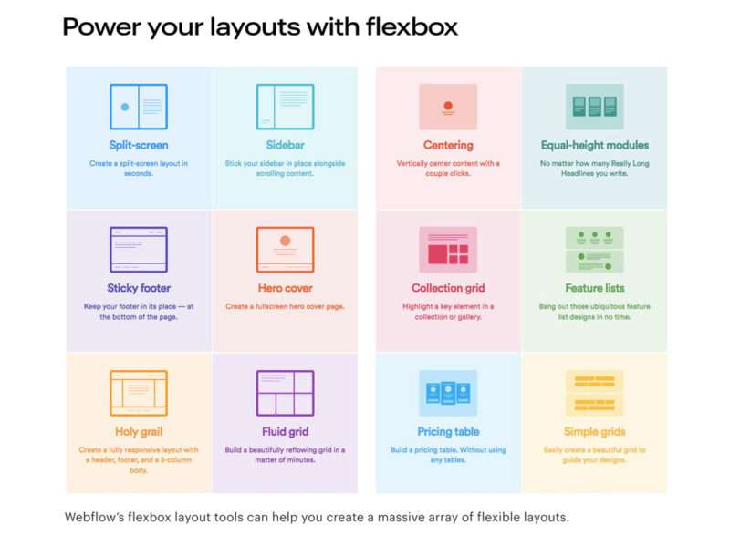
Photo Credit: webflow.com
In short, the elements will respond to the screen size by resizing themselves to fit properly.
With a fluid layout, you have the screen divided into columns, with the heights and widths scaling rather than being set to a fixed dimension.
2.2 Adapt for Touchscreens
Touchscreen has become the primary way that users interact with their mobile devices.
Unlike desktops and laptops, smartphones are designed to be used primarily through touch input.
By adapting to touchscreen, mobile apps can offer a more intuitive and natural user experience for users, which is key.
This allow users to interact directly with the app’s interface, using familiar gestures like swiping, tapping, and pinching to navigate and interact with the app’s content.
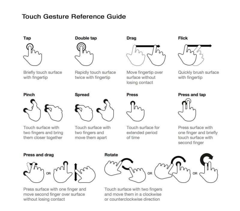
In addition to giving a more natural user experience, touchscreen can also make mobile apps more accessible to a wider range of users, like people with mobility impairments or disabilities who don’t require the use of a keyboard or mouse.
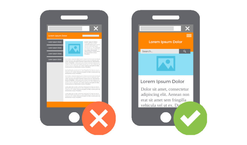
2.3 Make Sure Images and Videos are Responsive
If you have images and videos on your website, they aren’t going to look good on smaller screen sizes unless you make them responsive.
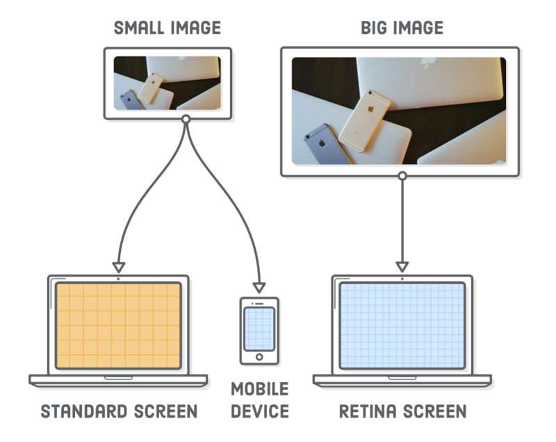
Photo Credit: internetingishard.com
PRO TIP:
Use modern image tag attributes to ensure your assets are responsive to multiple screen sizes, devices, and resolutions.
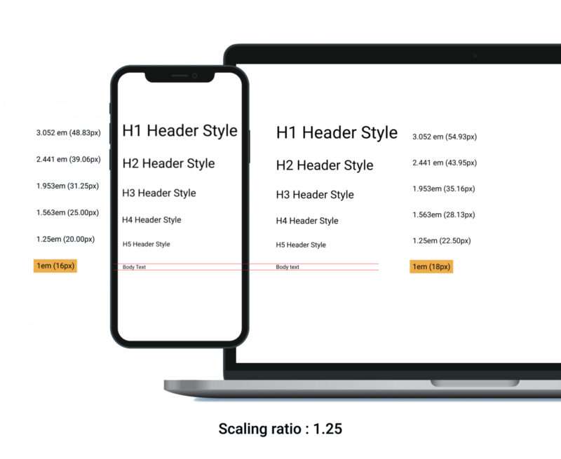
2.4 Create Responsive Typography
The fonts on your website also need to be responsive.
When creating a website for desktop, it’s normal for web developers to set the font sizes using pixels, but this will likely be too big and overlap other content when viewing the site on smaller mobile screens.
To make typography adjust to multiple screen sizes, you should use the relative unit called a “rem” instead of the absolute unit of pixels. The size of the font will depend on the size and resolution of the screen.
CSS Units
- PX: a single pixel
- EM: a relative unit that’s based on the font-size of the element
- REM: another relative unit that’s based on the font-size of the element
- VH (viewport height) and VW (viewport width): the percentage of the viewport’s height or width
- %: the percentage of the parent element
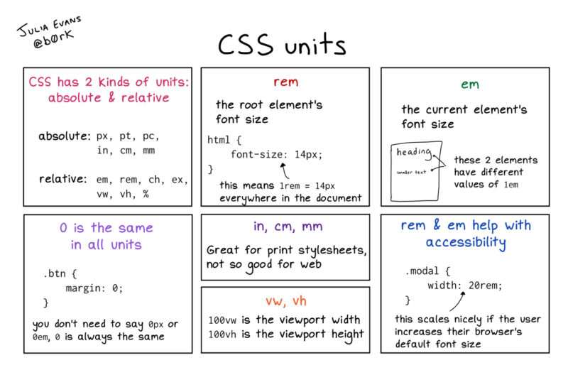
Photo Credit: twitter.com
2.5 Test for Responsiveness on Real Devices
When making a website mobile responsive, it’s crucial to test how everything looks and functions on real devices.
This will help you understand the mobile experience and how it will look for users.
Rather than going out and buying all kinds of mobile and tablet devices, you can use an online device emulator like BrowserStack to see how your website looks on both new and old devices.
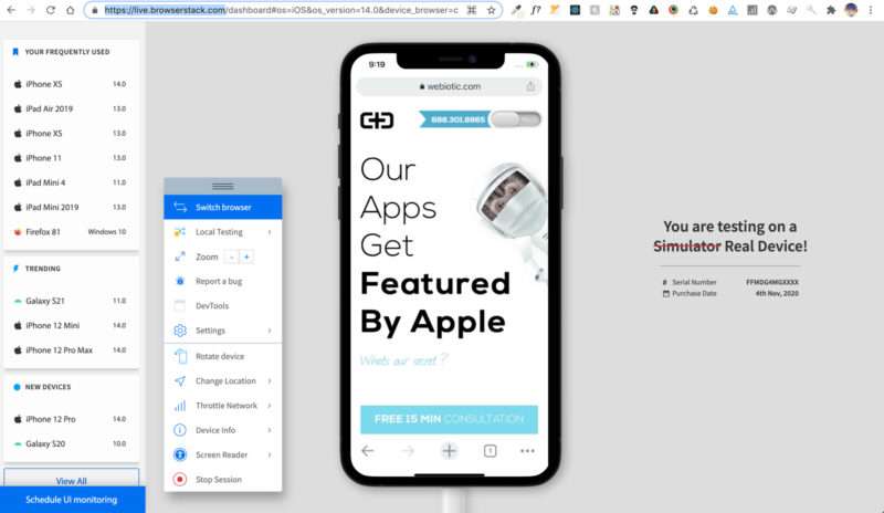
There are other ways you can test the responsiveness of your mobile website, like using Chrome Developer tools.
This allows you to select various screen sizes and devices right from your browser’s inspector tool.
PRO TIP:
If you’re on a tight budget and timeline, you can use pre-designed themes and layouts to create a responsive website. For example, WordPress is a platform that offers a wide variety of free and paid themes to choose from that offer built-in responsive properties
2.5 Test for Responsiveness on Real Devices
At the end of the day, the purpose of a website is to create the best user experience possible so your target users will keep coming back.
They should be able to navigate through your website seamlessly and without having to zoom in or out to see all the content. The page shouldn’t take forever to load. Font sizes should look correct and responsive images should be used.

Neglecting this will give users a poor impression of not only your website but your brand. Poor mobile design will make you look unprofessional.
Additionally, creating a good mobile user experience means attracting a wider audience since users can access your website from various devices.
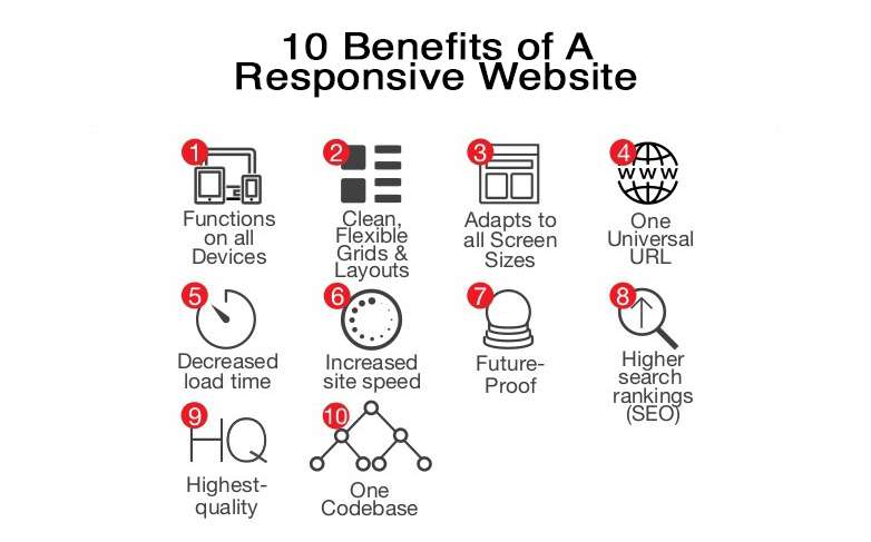
Let’s take a look at a few other benefits to creating a mobile responsive website.
3.1 Boost SEO
SEO is crucial for any business. Google favors websites that are mobile-friendly and will rank them higher in search results.
3.2 Keeps Everything Consistent
When it comes to your website design and brand, consistency is important. Responsive websites ensure everything looks and feels the same across all breakpoints.
Photo Credit: slideshare.net
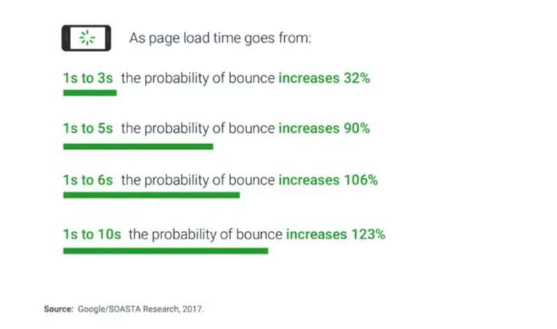
3.3 Lower Bounce Rates
Users simply don’t have the attention span to deal with websites that are slow or unresponsive on mobile. If your website doesn’t look good on their device, they’re going to head over to the competition.
By implementing mobile responsiveness, like easy navigation and clear CTAs, you’ll reduce bounce rates.
3.4 Cost-Effective
Creating one website that’s responsive (as opposed to creating a separate website for mobile) is a cost-effective way to reach mobile users.
It takes less time to develop which will save you money in the long run, especially when you consider the time it takes to maintain and update your website.

3.5 Increased Mobile Traffic
Creating a website that’s mobile responsive will ultimately drive more traffic to your website since more and more people are accessing the internet through their mobile phones.
3.6 Improved Conversion Rates
All of the points mentioned above will contribute greatly to your website seeing improved conversion rates.
Creating a top-notch, smooth mobile user experience will keep users on your site and keep them coming back, which translates to increased sales.

When building a website or working to make an existing website mobile-friendly, just remember—the user is boss.
Always strive to create a user-centric approach to ensure your brand is reaching its full potential. Create a mobile marketing strategy and analyze your mobile web traffic to see how you can improve the user experience.
Our Simple Starter package can help you take the right step forward by creating a technical write-up of your mobile app or website ideas, creating mockups, and finding your target audience.
What steps can you take today to make your own website more user-friendly?