
Building a mobile app is an exciting and rewarding endeavor, and there’s plenty to think about.
There’s the brainstorming and ideation phase, design phase, mockup and prototyping phase, coding phase, and marketing phase.
In short, there are a ton of details, big and small, you’ll need to know about to launch your app successfully.
Knowing the differences between screen size and screen resolution is just one of those important details you’ll need to be ready for when building an app for multiple devices.
Let’s take a look.
Table of Contents
First, let me start by saying, screen size and screen resolution aren’t the same thing and shouldn’t be used interchangeably.
We’ll get into the details of both in the next section.
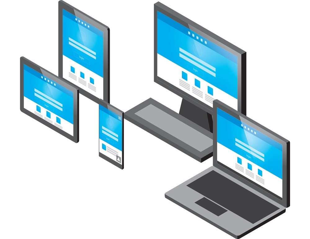
It’s crucial to have a good understanding of each of these terms when it comes to developing an app because they each have their place in optimizing an app for various devices and screen sizes, like smartphones, tablets, smart TVs and other screens.
You also want to make sure the app looks good when rotating your smartphone from portrait mode to landscape mode.
Photo Credit: broadbandsearch.ne
In today’s digital world, building an app with multiple screen sizes in mind shouldn’t be treated as an afterthought.
PRO TIP:
Apps that don’t follow specific guidelines, like adhering to screen size and resolution rules set by Apple, for instance, won’t have a chance at being accepted in app stores.
As already mentioned, screen size and screen resolution aren’t the same thing.
Screen size refers to the physical dimensions of a device’s display, measured in inches or centimeters. Screen resolution, on the other hand, refers to the number of pixels displayed on a screen, measured in pixels per inch (PPI) or pixels per centimeter (PPCM).
While the two concepts are related, they’re not the same and should be considered separately when developing mobile apps.
For example, a device with a larger screen size may have a lower screen resolution, and vice versa. It’s important for developers to take both screen size and resolution into account when designing and developing apps to ensure a consistent and optimal user experience across different devices.
2.1 Common Terminology
Let’s take a quick look at some common terminology you’ll find when referring to screen size and resolution.
Pixels
Pixel, short for picture element, is the smallest individual element that makes up a display. It’s the single color dot from which you can create a larger image.
The number of pixels in an image is what determines the resolution.
For example, if you have a 10×10 pixel image, it means that the grid is 10 pixels wide and 10 pixels high, meaning you have a total of 100 pixels.
Photo Credit: hobo-web.co.uk
Points
Points aren’t the same thing as pixels. This is a unit of length, most often used to measure the height of a font.
1 point equates to 1/72th of an inch.
How many pixels equal a single point depends on the resolution of the given image. If you have an image that’s 72ppi (pixels per inch), then one pixel will equal one point.
DPI
DPI is short for dots per inch and is also sometimes referred to as PPI, which is pixels per inch. DPI calculates the number of pixels in an inch of screen.
DP
DP stands for density independent pixel. It’s a unit nearly identical to points and is used by Android.
One dp is equal to roughly one pixel on a medium-density screen (160dpi). This is the baseline density, and Android will translate this value to the correct number of actual pixels for other densities.
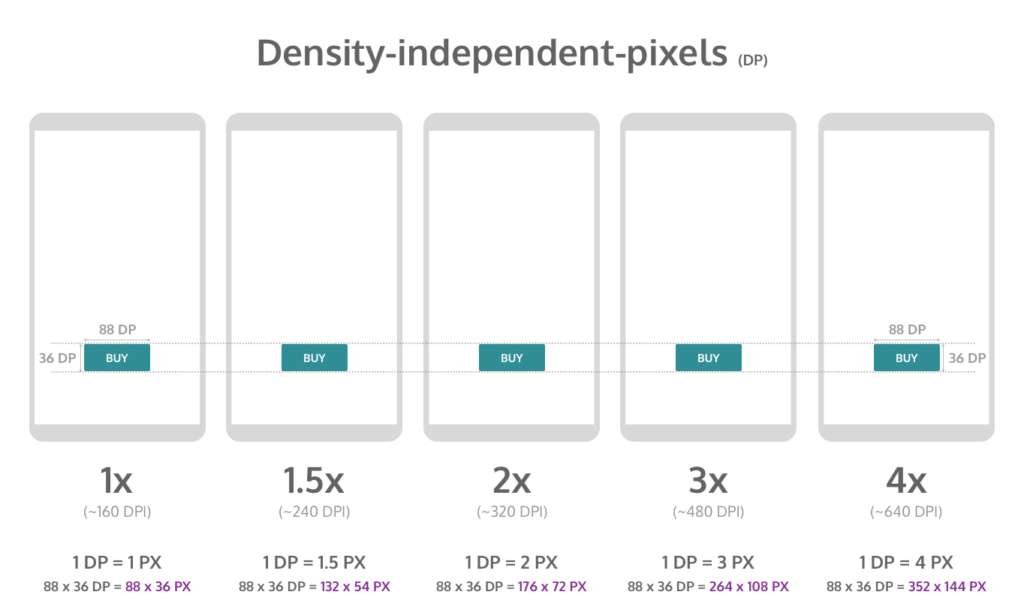
Photo Credit: blog.prototypr.io
You would use dp when designing Android layouts and points for when designing iOS layouts.
Here is how you can convert points and pixels:
iOS Pixels = (Points x DPI) / 163
Android Pixels = (DP x DPI) / 160
2.2 How to Calculate PPI
To calculate the pixels per inch (PPI) of a specific device, you’ll need to know the resolution of the device’s screen (measured in pixels) and the physical size of the screen (measured in inches). Once you have that, you can use the following formula to calculate PPI:
PPI = (resolution in pixels) / (screen size in inches)
So if a device has a screen resolution of 1080 x 1920 pixels and a screen size of 5 inches, the PPI would be calculated as:
PPI = (1080 x 1920) / 5 = 432 PPI
It’s worth noting that PPI is often used as a way to compare the sharpness or clarity of different screens, but it’s not the only metric to take into account.
Viewing distance, color accuracy, contrast, and brightness also play important role in overall visual quality of the device.
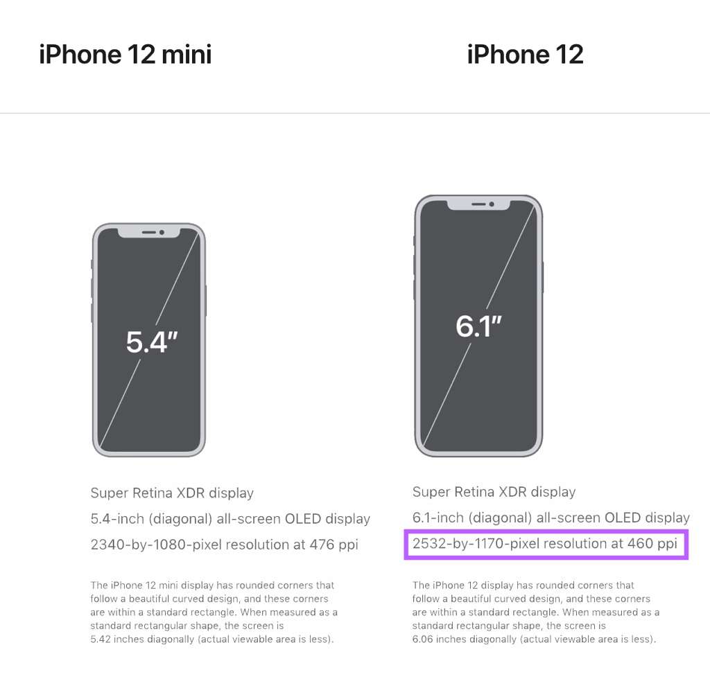
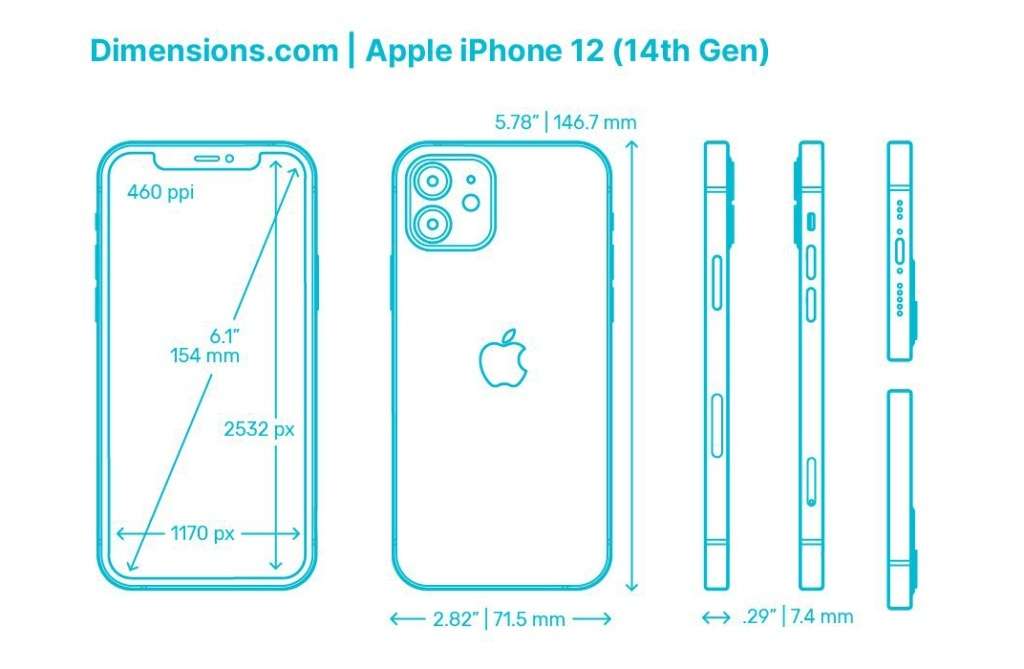
1. Square both resolution numbers and add them together:
(2532 x 2532) + (1170 x 1170) = 7779924
2. Get the square root of 7779924 = 2789.25
3. Divide that new number (2789.25) by the screen size (6.1 Inches) = 457 PPI.
According to Apple, the PPI they have listed for the iPhone 12 is rounded up to 460 PPI.
PPI is important because it tells you how well that image will be displayed on a specific device.
Just like with iOS, Android also runs on several different devices, each of which have varying screen sizes and even pixel densities.
When you develop an app, you need to make sure the system will scale and resize to adapt its UI interface to these different screens.
If you’re developing for Android applications, be sure to check out their thorough documentation on how to adapt your app accordingly.
Let’s run through some basics for developing an app for Android screen compatibility.
3.1 Screen Sizes
The screen size takes into account things like the screen orientation, screen UI elements, like a navigation bar, and changes to the window configuration, like multi-window mode.
By default, your app’s layout will be resized by Android to fit the screen it’s being viewed on.
To ensure it resizes well, app developers will need to implement a flexible app layout.
For example, rather than hard-coding the size and positioning of UI elements, it’s better to allow view sizes to stretch. Specify their positions relative to the parent or sibling views so the intended sizes remain the same even as the layout changes.
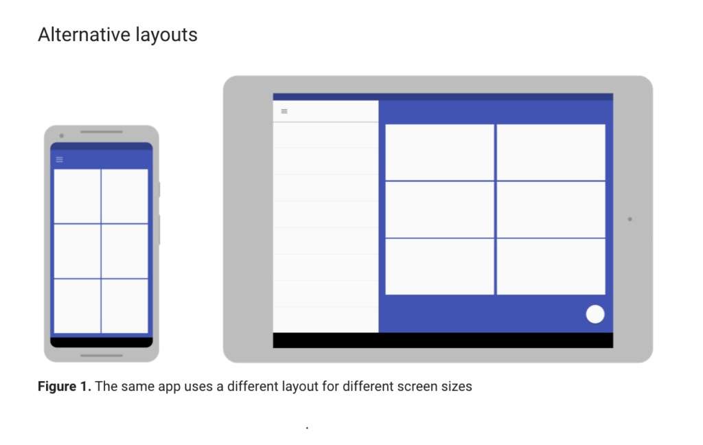
While flexibility is important, so too is having alternative layout designs to optimize the user experience.
Android allows you to use alternative layout design files that the platform will use at runtime based on the screen size of the device being used.
PRO TIP:
Since your layout should stretch to accommodate the current screen size, your images should also be able to stretch without getting skewed.
Android solves this by using nine-patch bitmaps where you can specify the small pixel regions that can stretch, leaving the remainder of the image unscaled.
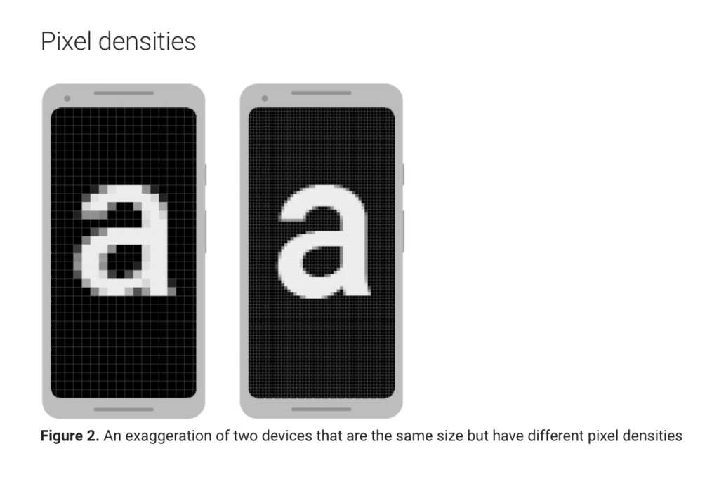
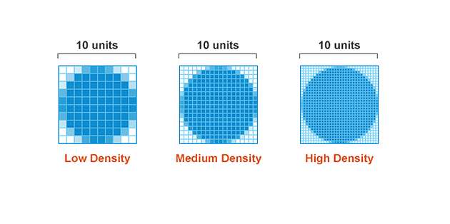
3.2 Pixel Density
Pixel density is essentially the DPI, which if you remember from our previous section, is the number of pixels in a physical area of the screen.
The goal when developing your app is that it has density independence, which is when it has the ability to maintain the physical size of the UI design when shown on screens with varying pixel densities.

This is important because without it, UI components, like a button, for example, might look too big on a low-density screen or too small on a high-density screen.
It’s also crucial to ensure your images look their best on all screens by providing alternative bitmaps to match various screen densities.
For instance, if you only have bitmaps for medium density screens, it might not look good when Android automatically scales them up on high-density screens.
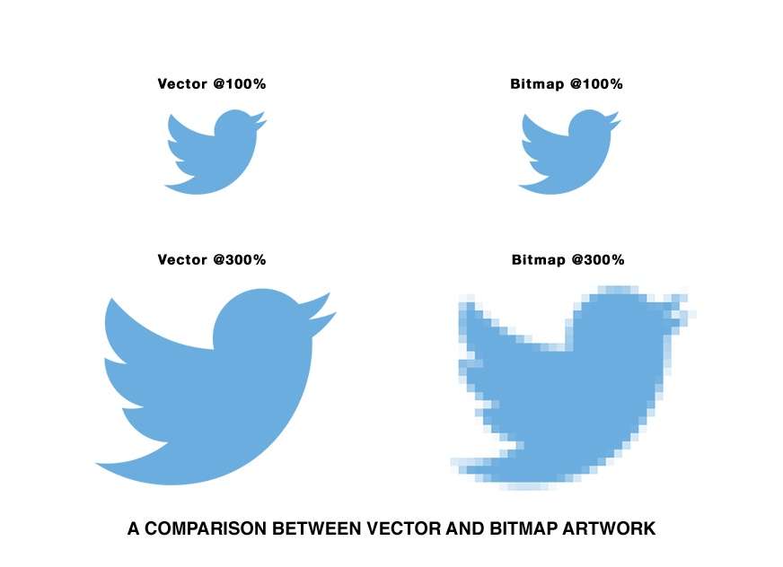
Photo Credit: thread-creative.co.uk
In some cases, you can avoid having to create separate images for each density by using vector graphics.
Since vector graphics uses geometric line paths rather than pixels, they can be drawn at any size without scaling issues.
3.3 Screen Incompatibility
Android offers all of the tools and documentation you need to ensure your app is configured and available for all screen sizes.
However, you can declare your mobile application supports only specific screens if you don’t want it available on certain screen configurations due to incompatibility.
Android allows you to limit how much it can resize your app and even restrict which devices can install that app.
You can declare a maximum aspect ratio, a maximum screen size, and restrict your app for specific sizes and densities, if you’d like.
With that said, Android recommends you design your app so it can adapt to all screen sizes and densities.
iOS has similar guidelines for the visual design and layout of mobile apps, but it’s a bit more strict and less forgiving.
Let’s take a brief look at what you need to know when developing an iOS application in regards to adaptivity and layout.
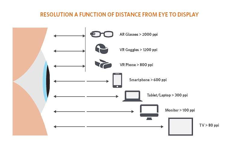
Photo Credit: appliedmaterials.com
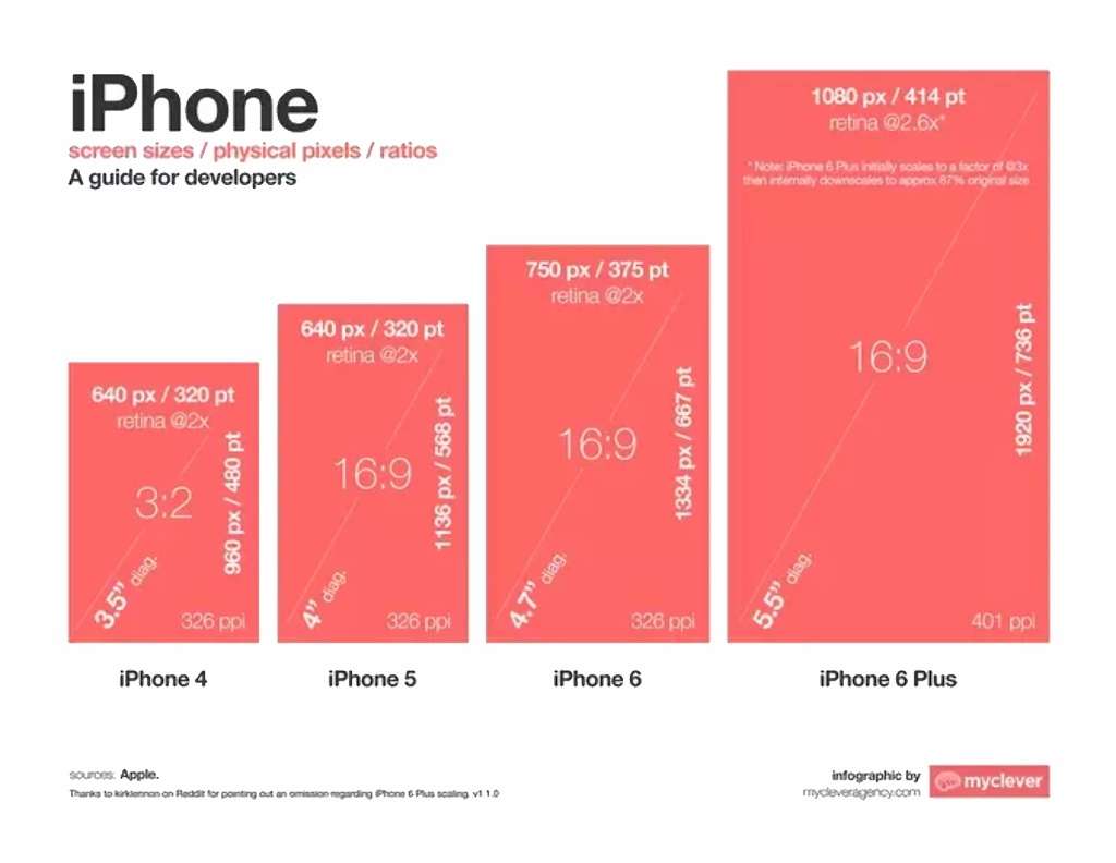
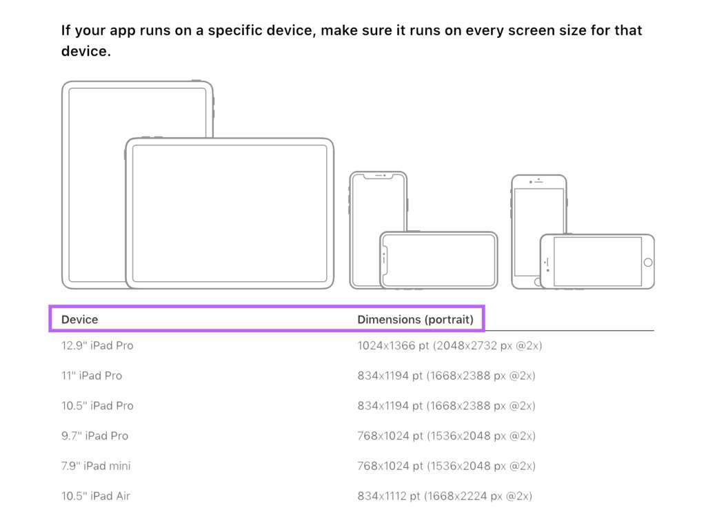
4.1 Screen Sizes and Orientations
iOS has many screen sizes which can be used in portrait or landscape orientation.
All devices have a rectangular, edge-to-edge display.
If you visit the iOS documentation page, you can see every device as well as the corresponding dimensions.
4.2 Image Size and Resolution
iOS uses a coordinate system based on measurements in points, which translate to pixels in the display.
A standard, baseline resolution has 1:1 pixel density, with 1 pixel equating to 1 point. Since higher resolution displays have higher pixel density, they demand images with a greater number of pixels.
Photo Credit: dwh-uk.com
If you have a standard resolution image that’s 100px x 100px, for example, the @2x version would scale it up to 200px x 200px, and @3x would scale it up to 300px x 300px.
PRO TIP:
Provide high-res images for all devices your app will support. You can do this by multiplying the number of pixels in each image by a specific scale factor (e.g. @2x, @3x)
4.3 Design High-Resolution Artwork
Here are some tips on designing high-res art for iOS mobile apps:
- Your images will look best on iOS devices when using an 8px-by-8px grid. This will keep your lines sharp and ensure the content is crisp on all sizes.
- Use the appropriate format, like de-interlaced PNG files for bitmap/raster artwork, and JPEG for photos, etc.
- Use the 8-bit color palette for PNG graphics, which will help reduce the file size without a loss of quality.
- Optimize JPEG files by finding the right balance between file size and quality.
- Provide alternative text labels for icons and images for accessibility purposes.
4.4 Read the Docs
As you can tell from these past two chapters on iOS and Android guidelines, there’s a ton of details you’ll need to know about and implement when creating an app for multiple devices and screen sizes.
When in doubt, read the docs! Both platforms come with thorough documentation on best practices and specifications for designing an app on multiple devices.
Whether you’re a designer, app developer, or entrepreneur, developing a mobile app that’s available for multiple devices will require knowledge on various design aspects, like screen size and resolution.
Familiarize yourself with all of the terminology involved and read the documentation given by the platform you’re developing for to ensure your app is set up for success.
And most importantly, don’t be afraid to get the help you need.
Our Simple Starter is a three-step approach that sets the stage for the development of your app: a technical writeup, which is like a blueprint for your app, wireframing to bring the technical writeup to life, and last, target user analysis that involves heavy market research into your app’s niche.
What checklists and tools do you use when designing an app for all devices?