
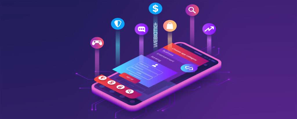
So you’ve gotten your users to download your app. Awesome!
What’s the very first thing they’re going to see after downloading the app and logging in?
That’s right, the home screen.
The mobile screen UI is going to give users a first impression of your app, so make it count. Remember, the difference between a good mobile application and a bad one is often the quality of the user experience
Not only does your app need to load fast and offer exceptional functionality that brings value to your target audience, it needs to be intuitive and easy-to-use, which has a lot to do with it’s UI (user interface).
In this article, we’ll look at what goes into mobile app screen design, the different approaches, and some best practice tips.
Table of Contents
- Types of App Screens
- Tutorial Screen
- Splash Screen
- Home Screen
- Profile Screen
- Mobile App Screen Best Practices
- Avoid Clutter
- Use Familiar Mobile Screens
- Keep User Input Minimal
- Keep Readability In Mind
- Be Mindful of Tap Targets
- Understand Various Screen Sizes
- Iterative Design and Updates
What happens when a user first logs into your app can vary, depending on the app.
Some apps chose to present them with a tutorial on steps to take to begin using the app, others chose to present a basic home screen.
In this chapter, we’ll take a look at the most popular and common mobile screen UI to help you decide which is best for your app.
1.1 Tutorial Screen
Some apps opt to have a sort of onboarding tutorial when users first launch the app to help them get started using the app and understanding its features.
Users will often be presented with a series of screens that present the app, it’s navigation and menus, features, and more.
Instead of multiple screens, it can also use animations or pop ups to help guide users through the app and its functionality.
The approach with an onboarding tutorial screen can vary greatly, but there are a few commonalities these types of screens share.
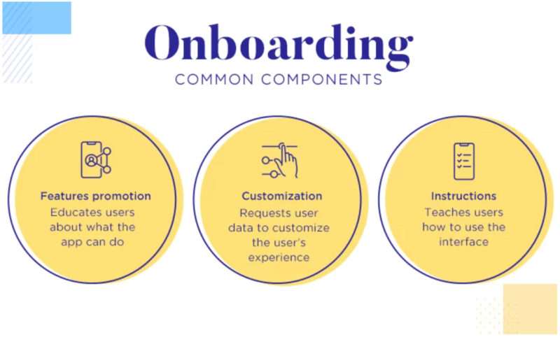
Photo Credit: justinmind.com
For example, many designers will choose to have a mascot or character within the app that communicates the layout of the app and its features.
Another common tendency in tutorial designs is to use custom illustrations or animations to showcase specific features.
Above all, using copy that is short yet helpful is key in creating the best tutorial screens.
PRO TIP:
You never want to bombard users with too much information upon the first app launch. They’ll be overwhelmed and wont want to bother reading it all.
Onboarding tutorial screens should have copy that’s concise, readable, and to-the-point.
1.2 Splash Screen
A splash screen is the first screen a user sees when they launch an app for the first time. You can think of it as an introduction screen that appears briefly while the app is loading in the background.
It’s typically a simple and minimalistic mobile screen design that includes the essentials, like the app name, logo, and maybe a brand slogan, and is meant to welcome users and set the tone for the app.
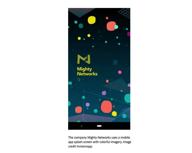
Since this is a user’s first experience with the app, designers will want to ensure the splash screen looks great on all devices.
As a result, you’ll notice that the content of a splash screen is often centered in the middle of the screen. This way, designers don’t need to design a splash screen for every device out there.
They can design just one screen that will look good on any device.
Another thing to keep in mind when designing a splash screen is that it’s typically only shown to users for 4-8 seconds. Showing it to them longer than that can be annoying.
1.3 Home Screen
The home screen is the main screen of a mobile app. It’s the screen users interact with the most and contains all of the options for the app.
How a home screen is designed really depends on exactly what the product is, whether it’s a music app or a fitness app, but just like any other screen type, every home screen has some commonalities that ensure a smooth user experience.
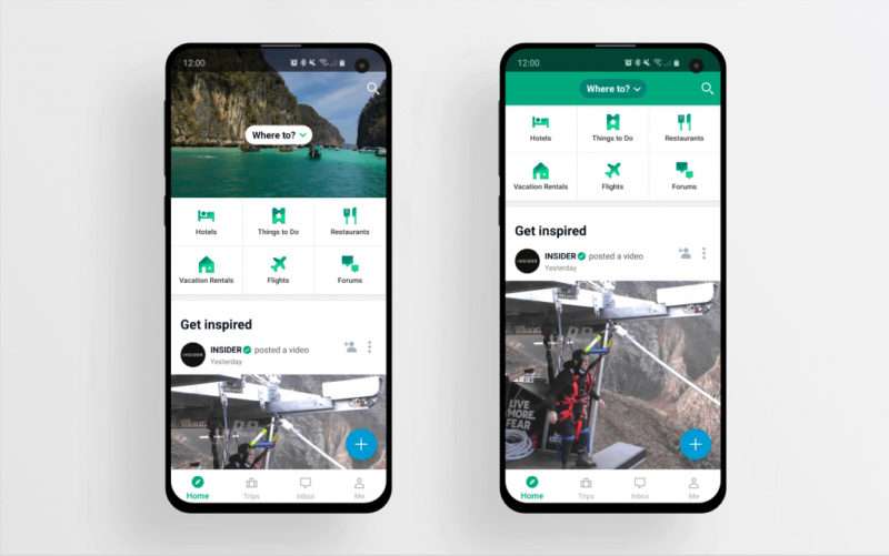
Photo Credit: uxstudioteam.com
You’ll notice that mobile app home screen user interface will contain some crucial visual elements, like a search field or buttons so users can find what they need with ease.
It may also have navigation elements, like a menu, so users have quick access to other areas of the app.
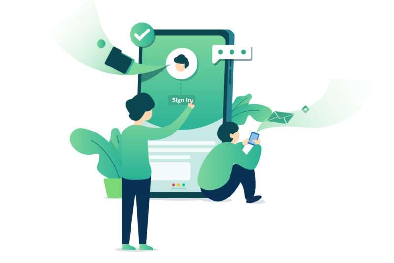
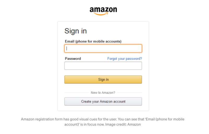
1.4 Profile Screen
Another common screen to present to users when they first open an app is their profile screen (or a log-in screen if it’s their first time opening the app).
Allowing users to create an account and add their information is an important way in which apps can gather data from users to use for things like personalized marketing and more.
Having a profile is also a great way to create a more personalized in-app experience for users. It involves them in the community of the app and allows them to share their information or social media with others.
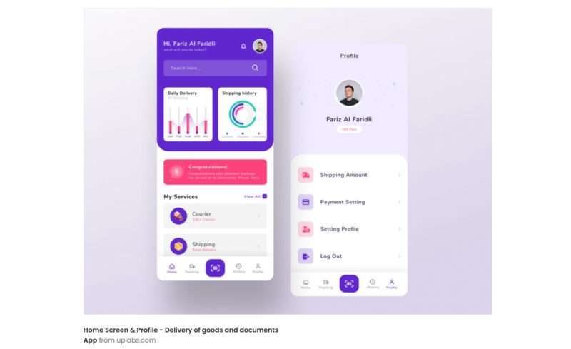
If a user is logging in for the first time, the log-in screen should always be simple and minimalistic, containing only what’s essential to create an account, like a username and password.
A profile page should allow users to enter more information about themselves and be oriented for the app’s target audience.
PRO TIP:
Conduct thorough user research to ensure your profile screen meets the needs of your target users.
While we already touched on some basic best practices when it comes to the various screen types of a mobile app, let’s dive in deeper into what design do’s and don’ts are involved in creating the best mobile screen UI design for users.
2.1 Avoid Clutter
This is probably the #1 tip to keep in mind when designing pretty much anything.
Clutter is the archnemesis of good design.
It overloads users with too much information, whether it’s visuals, UI elements like buttons and icons, or text, which can have a negative impact on users.
While this is a big no-no on desktop, it’s even worse on mobile devices since you’re dealing with far less screen real estate.
When designing a mobile app screen, no matter what kind of screen it is, stick to what’s absolutely necessary and get rid of everything else to optimize user comprehension when using your app.
2.2 Use Familiar Mobile Screens
While it may be tempting to break away from the norm when it comes to app screen design, you should always remember that users want their mobile app experience to feel familiar so they know what to do and what to expect.
Stick with a mobile app design that users understand and can easily navigate through. There shouldn’t be any kind of learning curve.
Even when using an onboarding tutorial screen, it should look and feel similar to other tutorial screens. Always try to limit what mobile users need to learn to use your app.
2.3 Keep User Input Minimal
When designing screens that require user input, such as login screens and profile screens, it’s important to remember that typing on a mobile device isn’t as easy or comfortable as typing on a desktop computer.
While you may see it as an opportunity to gather as much information as possible from users, requiring too many input fields or unnecessary information can be annoying, so don’t overdo it.
2.4 Keep Readability in Mind
No matter what screen you’re designing for, chances are, it’s going to contain some content.
Always remember that mobile devices have small screens when compared to desktop computers and so it can be challenging to fit lots of information into the mobile UI.
This is why designing for mobile should be taken with a different approach than designing for web.
Content on a mobile device should be concise and easy to skim through, meaning users don’t necessarily need to read each and every word to understand the information.
They can simply pick out words and phrases as their eyes scan the screen.
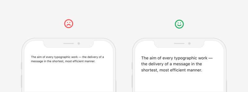
Photo Credit: uxdesign.cc
2.5 Be Mindful of Tap Targets
When you’re designing a mobile app screen or mobile apps in general, it’s important to always consider the tap targets.
Tap targets, or touch targets, are areas on your app’s screen that respond to user input, like buttons or navigation menus.
Make sure your tap targets are large enough that users can easily tap on them. There’s nothing more frustrating than accidentally tapping the wrong thing or a tap not registering at all.
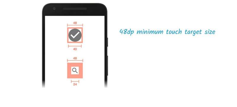
Photo Credit: web.dev
2.6 Understand Various Screen Sizes
Your users will be accessing your app from all kinds of devices and screen sizes.
You want your app screen to look good on all of them.
This is why on splash screens, you’ll notice that the content is typically centered in the middle of the screen. This way, designers don’t need to design a splash screen for every device out there. It should look good on all of them.
On the other hand, if you would rather make use of all the screen’s real-estate, you’ll need to have a good understanding of the various screen sizes and resolutions to ensure your app looks good on them all.
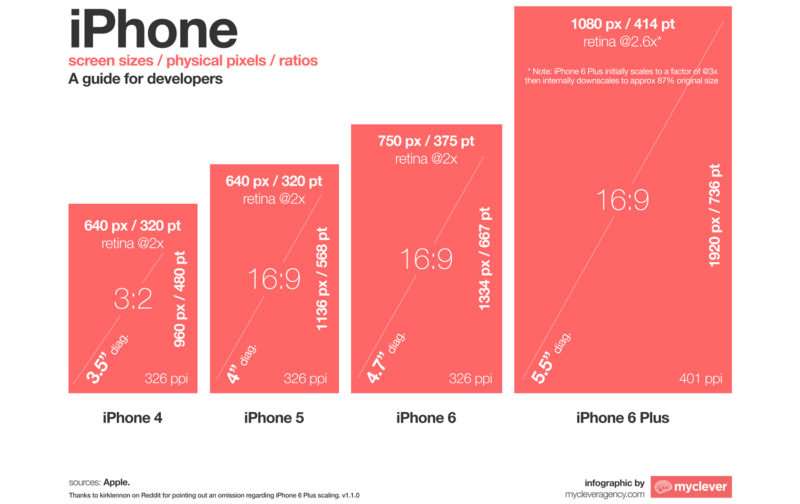
You’ll need to consider not only smartphones but other devices like tablets as well.
Your design will need to be optimized for as many screen sizes as possible, but especially those your target audience uses most.
In the dynamic world of app development, ‘set it and forget it’ just won’t fly.
An initial launch isn’t the end of your design journey, but rather the beginning.
Iterative design and regular updates are key. As you gather user feedback, analytics data, and market insights, tweak your design accordingly.
Tech trends evolve, user preferences shift, and new devices emerge – your app should too.
So, keep iterating, refining, and innovating. It’s the secret sauce that keeps your app relevant, user-friendly, and ahead of the competition. A steadfast commitment to evolution can turn a good app into a great one.
3.1 User Feedback and Analytics
Keeping your finger on the pulse of user sentiment is key for successful app screen design.
By systematically gathering feedback, you’re armed with insights that can spotlight areas for improvement.
Tools like in-app surveys or user testing sessions can be invaluable here.
On the analytics front, leverage features of your platform to track user interaction data. How users navigate, which features they use most, where they drop off—all these can guide your design tweaks.
Remember, both positive feedback and constructive criticism are goldmines for enhancing the user experience. But don’t just rely on raw data—context matters. Analyze, interpret, and act!
Whatever app screen you decide to present to users when they first launch your app, just remember that it’s going to be their first impression of your product, so design with care!
Consider what the user objective should be when accessing your app and visiting this screen.
What do you want them to do?
If you could use some help with mockups and research, we got you covered.
Our Simple Starter package includes not only a technical writeup of your app ideas, but also wireframes of every screen in your app as well as market and user research.
Which type of app screen have you found to be the most effective for users?