
If you’re in the midst of developing a brand new mobile app, the app icon may be the last thing on your mind, but it’s actually an incredibly important aspect of the project and should be given its due diligence.
In short, an app icon is a visual representation of your app displayed in the app store and on your home screen. It’s one of the first encounters your users will have with your mobile app and so it’s a fundamental component in building a positive and memorable user experience.
And once you’re ready to move on to creating an app preview video for app stores, you can learn how in this video.
In this article, we’re going to cover the whole topic of app icon template and give you some useful tricks that will help you design the best app icon and run through how to get started.
Remember, a good app icon can go a long way in swaying a user to download your app. Just like a catchy app title, description, and thumbnails, the app icon is what will help capture your users and pique their interest. It’s one of the first things a user will see before deciding to download your app, so it has to be grabbing.
Let’s review a few useful tips that will get you on your way.

Make your App Icon Memorable and Recognizable
When designing a successful app icon, factors like visual attractiveness, simplicity, and being in step with platform guidelines are all important, but making it memorable and recognizable is key.
If I told you to imagine the Uber or Facebook icon, I bet you could easily picture them in your mind without looking at your phone. And it’s not just because you use these apps all the time (sure, that helps in remembering them), it’s because the overall simple design stands out and is memorable. This makes the icons unique and easily recognizable, which is key.
When designing your app icon, you want it to be memorable and unique, but not too unique to the point that you’re confusing users. Try searching in the app store apps that fall into the same niche as yours. Take note of common colors or symbols these apps are using and prepare alternate versions for your own app.
Keep your App Icon Simple
While it may be tempting to utilize those design skills and spruce up your app icon to the max, don’t. Simplicity is key, and adding too much complexity to your icon can have an impact on its success.
Some of the best app icons are so simple a child can draw them in a matter of seconds. A great way to test out your icon design is to show it to a child and then hide it from them. If they can recall the design and draw it with ease, that’s a good sign.
Make Sure Your App Icon Matches Your App’s Brand
Another important factor when designing your app icon is ensuring that its style and tone matches that of your overall app and brand. You want your UI to be consistent, so keep elements like color palettes, symbols and fonts uniform. If your app uses all Helvetica font, you don’t want to use Comic Sans in your icon.
Remember, the idea is to build a coherent, original, and consistent experience for your users. It’ll make your app icon all the more memorable and recognizable.
Design with Platform in Mind
You also want to remember that every operating system has its own set of design principles. Not adhering to them when creating your app icon will bring a sense of discomfort for your users. While it may not be obvious to them, they will recognize something is off about your app icon design if the look and feel of it isn’t consistent with the platform. This is all a part of establishing good user experience.
While iOS and Android app icons look similar, they still have some noticeable differences in their design, such as proportions, size, and style. More specifically, when considering an app icon for iOS, you’ll notice rounded corners, which is not required for Android. Android app icons are a bit more flexible in this regard.
Additionally, iOS app icons lean towards a flat UI design trend and larger retina display than Android.It’s important to read through the guidelines for iOS or Android to ensure you get it right.
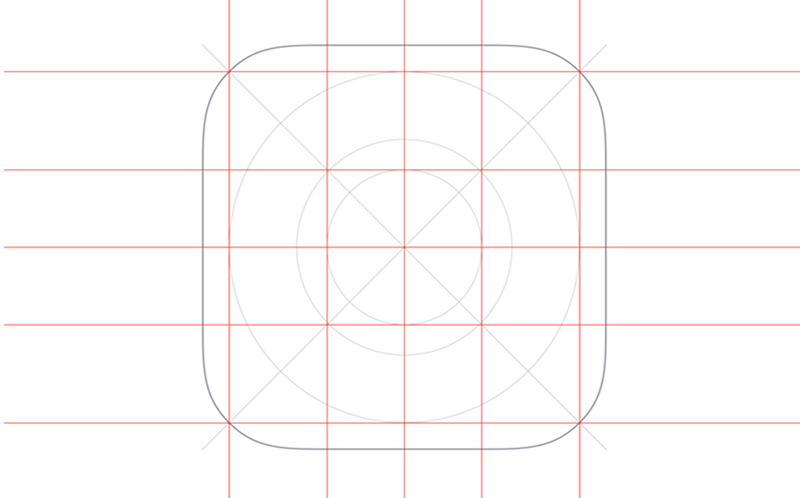
The first step in creating your own app icon is to carefully read through Apple’s Human Interface Guidelines to see what they recommend for app icon images. These documents contain a ton of useful information on how to design your apps, not only from a graphics perspective, but also from a UI perspective.
The section on Icons and Images reviews what sort of image sizes you will be needing to provide. You’ll notice that there are several different resolutions for the different iOS devices. So when you create your graphic asset, you’ll need these sizes.
App icon section
This section on their Human Interface Guidelines page reviews everything you need to know about building a beautiful and memorable app icon. Read through it and you’ll find some more recommendations on standards, such as not including any fancy backgrounds or patterns—basically, keeping your app icon simple. Remember, the point of your icon is to convey what your app is and does. A user shouldn’t have to look at it for more than a few seconds to understand its purpose.
You also should not be using words as part of your logo, no screenshots, and no photos. Don’t show apple hardware (trademark reasons) and keep your image corners squared. You don’t need to round them, as the system will automatically do that.
This section will also review the different sizes that you need to provide your app icon image in since your icon doesn’t just show up on the homescreen, but also in the settings, notifications, and other areas which all require a unique size.
Creating your graphic
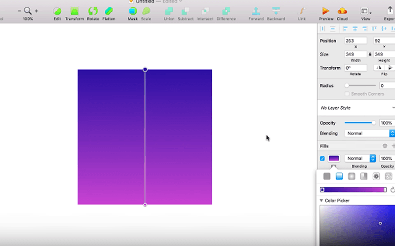
When it comes to actually creating your graphic, you can use whatever graphic program you’d like and are most comfortable with. These programs will either create the graphic in raster or vector format.
Vector format is best for app icons because it allows you to scale your image without losing quality. Rastor, on the other hand, can look fuzzy when enlarging. Sketch and Figma are examples of vector programs. Photoshop uses raster.
Once you choose your program, you would begin by creating a square and then choosing a gradient color. Any program should have gradients as a basic core functionality. At this point, you can draw your icon or design it on your own. You can export your asset as 1x, 2x, or 3x size, but you can also use an app icon resizer tool to resize as well.
The important thing when using an app icon resizer is to check that it’s been updated recently so you know it conforms with the latest Apple sizing guidelines.
And it’s as easy as that!
Sketch is a popular Photoshop alternative for designers and offers a simple, easy to use and super effective tool for things like vector drawing, general layout, and mockups.
Another perk to using their software is that it comes with some great app icon templates you can use to get started in designing your icon for both iOS and Android.
The first step is to visit Applypixels.com to purchase an app icon template for sketch which will essentially automate the process of rendering the various sizes needed with iOS apps. It features the proper icon shape, official icon grid, and gradients you can use in your app icon design.
The template conveniently allows users to preview their app icon in a native environment, like the home screen and app store. All you need is a copy of sketch version 3 or later.
The template comes with 3 pages—a preview page, export page, and symbols page.
The preview page, as you can guess, allows you to preview your icon. You can view it in the home screen environment and compare it icon with other stock icons on the platform.
The background section of the Sketch app icon template contains common gradients found in iOS. Here, you can find something you like, and build and tweak it from there.
The export page will show you the different slices sketch will export. The symbols page allows you to create a symbol for your icon, if you’d like.
- Create: You can create your icon in the size your users will see it, which will automatically scale to the required sizes for both platforms.
- Review: You can see how the icon will look in every size.
- Showcase: See how your icon looks on the phone’s home screen and in app stores. This helps compare it to other app icons.
- Export: Once you’re finished with the design phase, you can quickly and easily export your icon.
While following app icon guidelines is crucial in the development process, the most important thing is to be mindful of what goes into making your app icon memorable and recognizable.
Start doing research and paying closer attention to other app icons out there to find commonalities in their design. Show your app icon to friends and family to see what they think and if they can recognize the app’s purpose right away. Don’t be afraid to play around with different designs, backgrounds, and logos throughout the process.
Our Simple Starter package offers three simple steps to a successful app, which includes wireframe sketches that will show how your app will look and function once it’s published, among other key ingredients in planning an app.