
You’ve poured your heart, soul, and budget into developing what you believe is the next big app. The code is clean, the features are innovative, and you’re ready to conquer the app stores. Then reality hits: users download your app, open it once, and never return.

The harsh truth? It’s probably not your idea or your technology that’s failing – it’s your user experience. In today’s hyper-competitive app landscape, UX mistakes don’t just hurt your app – they kill it entirely.
Modern users form opinions about your app within the first 10 seconds of interaction. They expect seamless, intuitive experiences that feel almost magical. When you fail to deliver, they don’t give second chances – they simply delete your app and move on to a competitor who gets it right.

Table of Contents
- Ignoring Current UX/UI Trends and User Expectations
- Overlooking User-Centric Design Principles
- Creating Cluttered and Confusing Interfaces
- Implementing Poor Navigation and Information Architecture
- Neglecting Mobile Responsiveness and Touch Optimization
- Failing to Provide Adequate Feedback and System Status
- Maintaining Inconsistent Design and Branding
- Designing Weak Calls-to-Action and Conversion Paths
- Failing to Build Trust and Credibility
- Not Optimizing for User Retention and Engagement
1. Ignoring Current UX/UI Trends and User Expectations
The biggest mistake app developers make is treating UX design as a one-time decision rather than an evolving conversation with users. What worked in 2020 feels ancient in 2025, and users notice.
Modern users expect immersive, adaptive interfaces that feel almost alive. The latest trends include interactive 3D elements, AI-powered personalization, micro-animations that guide user behavior, and spatial navigation patterns. Apps that ignore these innovations don’t just look outdated – they feel clunky and frustrating to use.
The Cost of Falling Behind: Users compare your app to the latest versions of their favorite apps. If your interface feels dated, they assume your entire product is inferior. Modern UI elements like micro-animations aren’t just aesthetic choices – they guide user behavior and increase engagement by up to 40%.
How to Fix It: Stay current with UX trends by implementing subtle micro-animations that guide users through your app’s flow. Use AI-driven personalization to adapt content and features based on user behavior patterns. The key is selective implementation – don’t chase every trend, but identify which modern UX patterns genuinely improve your user experience.
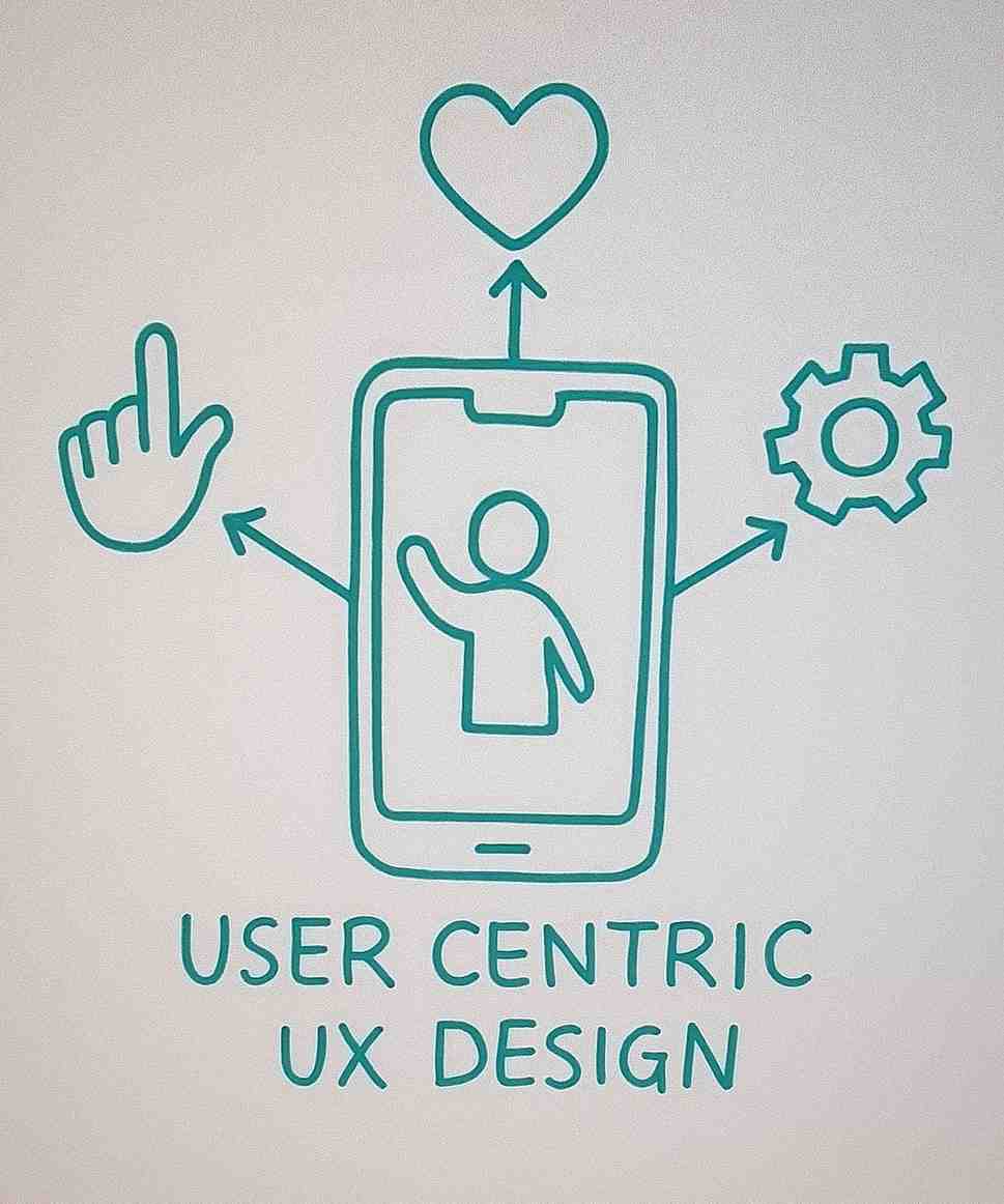
2. Overlooking User-Centric Design Principles
Here’s the fundamental mistake that kills more apps than any technical issue: designing for yourself instead of your users. Many developers fall in love with their own vision and forget that users don’t share their context, knowledge, or passion for the product.
User-centric design means designing with empathy, involving users early and often, and prioritizing their needs above internal preferences. Apps that don’t focus on real user problems or ignore feedback often deliver experiences that frustrate or confuse rather than delight.
How to Fix It: Conduct regular user research and usability testing throughout the development process. Involve users in the design process from ideation to launch through surveys, interviews, and prototype testing. Most importantly, iterate based on real user feedback, not assumptions or internal opinions.
3. Creating Cluttered and Confusing Interfaces
Visual clutter is the enemy of user engagement. When users open your app and feel overwhelmed by options, information, or visual elements, their first instinct is to close it and find something simpler.
Overloaded screens, unclear hierarchies, and excessive features overwhelm users and lead to immediate drop-off. Every element on your screen competes for attention. When everything seems important, nothing actually is.
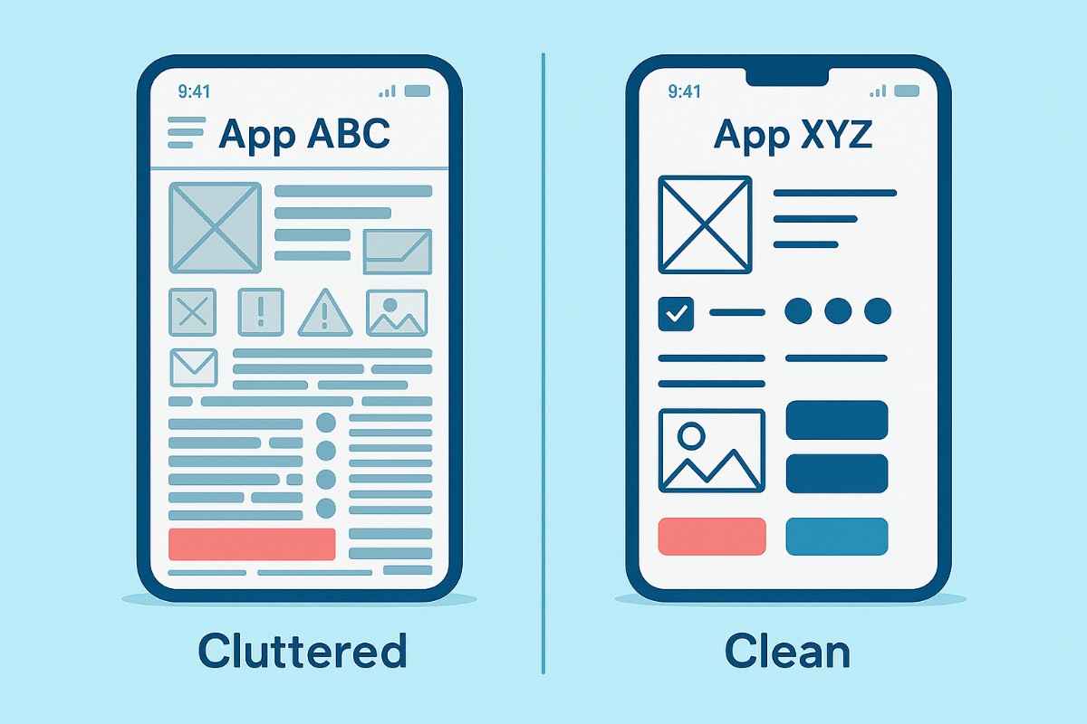
How to Fix It: Prioritize essential features and content ruthlessly. Use whitespace strategically to create breathing room and guide user attention. Highlight key actions with size, color, and placement that make the most important elements obvious. Follow the 80/20 rule: 80% of users will only use 20% of your features.
4. Implementing Poor Navigation and Information Architecture
If users can’t find what they need quickly, they’ll abandon your app. This isn’t just about having a menu – it’s about creating logical, intuitive pathways that match how users naturally think about your product.
Confusing menus, hidden features, or inconsistent navigation patterns create friction and erode trust. Users develop mental models of how apps should work based on their experience with other applications. When your navigation doesn’t match these expectations, users feel lost and frustrated.
How to Fix It: Design intuitive, consistent navigation menus that follow established patterns users already understand. Test navigation flows with real users to identify pain points and confusion. Use clear labels and logical groupings for content that make sense from a user perspective.
5. Neglecting Mobile Responsiveness and Touch Optimization
With most users accessing apps on mobile devices, poor mobile optimization is a cardinal sin that immediately alienates the majority of your potential audience.
Non-responsive layouts, small touch targets, or slow load times create immediate frustration. Touch targets need to be large enough for comfortable interaction, spaced appropriately to prevent accidental taps, and provide immediate feedback when pressed.

How to Fix It: Ensure your app adapts seamlessly to all screen sizes and orientations. Optimize touch targets and gestures for mobile usability, making buttons large enough for easy tapping. Prioritize fast loading speeds and lightweight assets that don’t drain battery or consume excessive data.
6. Failing to Provide Adequate Feedback and System Status
Users expect immediate feedback for their actions – whether it’s a button press, form submission, or loading state. Without clear feedback, users feel lost and uncertain if the app is working correctly.
When users tap a button and nothing happens immediately, they assume the app is broken or unresponsive. This uncertainty leads to repeated taps, frustration, and ultimately abandonment.
How to Fix It: Provide visual or haptic feedback for every user action immediately. Display loading indicators or progress bars for longer processes, and notify users of errors or successful actions promptly. Use micro-animations to show state changes and clear success/error messages.

7. Maintaining Inconsistent Design and Branding
Inconsistency in colors, typography, icons, or interaction patterns creates cognitive load and reduces trust. Users expect a cohesive experience across all screens and touchpoints.
When users encounter inconsistent design patterns, they must constantly relearn how to interact with your app. This mental overhead reduces satisfaction and increases abandonment rates.
How to Fix It: Develop and adhere to a design system or style guide that covers colors, typography, spacing, and interaction patterns. Maintain consistency in branding, language, and interface elements across all screens. Regularly audit your app for design inconsistencies.
8. Designing Weak Calls-to-Action and Conversion Paths
If your CTAs blend in or your conversion paths are unclear, users won’t take desired actions. Effective CTAs should be visually prominent and contextually relevant.
Weak CTAs are responsible for billions in lost revenue across the app ecosystem. Users need clear guidance about what actions to take and why those actions benefit them.
How to Fix It: Make CTAs stand out with contrasting colors and prominent placement. Use clear, action-oriented language that tells users exactly what will happen when they tap. Guide users step-by-step toward conversion goals with logical, frictionless flows.
9. Failing to Build Trust and Credibility
Users are wary of apps that feel untrustworthy or insecure. Missing trust signals can deter sign-ups and purchases, especially for apps handling sensitive information or payments.
Modern users are increasingly concerned about privacy and security. Apps that don’t clearly communicate trustworthiness face immediate skepticism and reduced adoption.
How to Fix It: Display trust badges, user reviews, and testimonials prominently. Be transparent about data usage and privacy policies. Ensure your app’s visual design communicates professionalism and attention to detail.

10. Not Optimizing for User Retention and Engagement
Acquiring users is only half the battle; retaining them is equally crucial. Apps that don’t encourage repeat visits or fail to personalize the experience lose users quickly.
Average app retention rates are devastating: 77% of users never use an app again after the first day. Poor retention optimization is the difference between a successful app and a failed one.
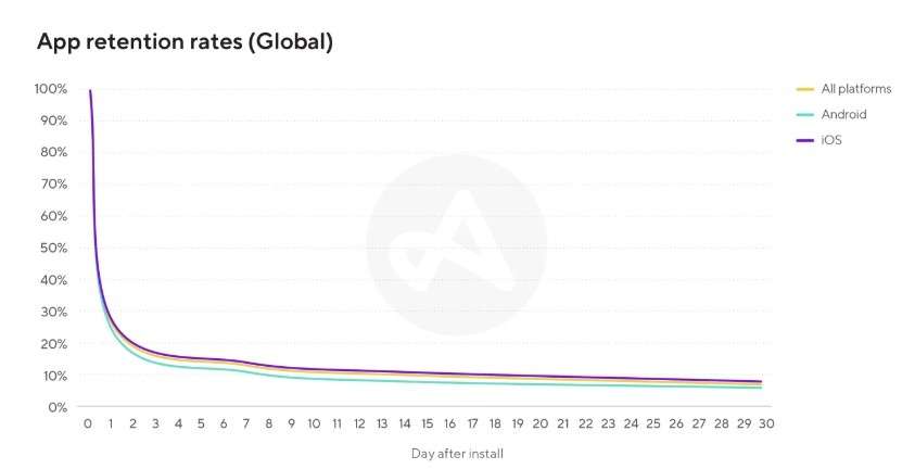
How to Fix It: Use push notifications and email reminders judiciously to bring users back without being annoying. Personalize content and recommendations based on user behavior. Continuously test and refine features to keep users engaged over time.
The Bottom Line
UX mistakes don’t just hurt your app – they kill it. In today’s competitive landscape, users have unlimited alternatives and zero patience for poor experiences. The apps that succeed are those that treat UX as an ongoing investment, not a one-time expense.
By avoiding these 10 critical mistakes and embracing user-first design principles, you can create an app that not only survives but thrives in the modern marketplace. Remember: great UX isn’t about following trends or copying competitors – it’s about deeply understanding your users and crafting experiences that genuinely make their lives better.
Your app’s success depends on getting UX right. The question isn’t whether you can afford to invest in proper UX design – it’s whether you can afford not to.

Don’t let poor UX destroy another app launch. Get a 15-minute free UX assessment with an experienced design strategist to diagnose the critical user experience issues hurting your retention, discover proven solutions that boost engagement by 300%+, and build a comprehensive UX optimization plan that covers user research, interface redesign, and conversion funnel optimization.